A map that shows what’s wrong with Washington

2008 Election Dot Map, NortheastThe recent government shutdown and flirtation with default has seriously deteriorated public trust in Congress, and in Washington more generally.  Disgust with Washington is often followed by bewilderment. How did things get this way?

While there is no single answer to this question, if I had to choose one, it would be current redistricting practices. There is a strong case to be made that political polarization (and associated intransigence and brinkmanship) are rooted in gerrymandered congressional districts.

Gerrymandering, the art and science of lawmakers choosing their own voters rather than the other way around, has ensured that most representatives in the U.S. House are safe from general election challenges.  Without those challenges, positions taken by elected officials are not exposed to debate and to the typically moderating effect of contested elections.  In contrast, in gerrymandered districts where it is clear that one party or the other has a more or less certain general election victory in hand, candidates from the opposing party opt out of running (or have little real chance of winning if they do). As a result, the only threats to these lawmakers come in contentious primary contests from the hard left and hard right.  Being “primaried” is now a common term among political strategists, and is often used to describe well-financed tea party challengers who unseat moderate Republicans. As moderation, from either side, is lost in primary challenges, the result is more rigidly ideological victors and the deadlock we see with increasing frequency in Congress.

This connection between redistricting, polarization, and legislative dysfunction is complicated, and as soon as political scientists start talking about the nuances of this subject the message sometimes gets lost.  So I decided to create a visual to help illuminate what is really going on…

Link to the full interactive Congressional Dot Map.

Continue reading

Need Census data during the shutdown?

One of the little noticed effects of the federal government shutdown is that many federal statistics and reports that we rely on are currently on hold.  For example, the all-too-important September jobs report never came, and if the shutdown continues, we all may miss out on measuring the unemployment rate for October.  Even updates to the consumer price index, which adjusts government benefits for inflation, may be delayed.

If you want to look up past U.S. Census Bureau data you will encounter problems as well. The popular American Factfinder and Census Bureau websites are now unavailable.  So, here are a few tips for those who us who are in need of data right now:

  • Free of charge, The University of Minnesota’s National Historical Geographic Information System provides aggregate statistics from the decennial censuses and the American Community Survey (ACS).  I have used data from these folks on many of my projects and can vouch for their simple and intuitive interface.
  • For the next few weeks, the Social Explorer website is providing free access to its data.  Social Explorer is a great website for Census data and also offers neat visualization capabilities.  But I wouldn’t get too cozy with using their services; they usually charge a fee, and it’s hard to say how long their generosity will last.
  • If you have some data analysis skills, the Integrated Public Use Microdata Series (IPUMS) project is still open.  The site is another Minnesota creation and is a favorite of mine.  They provide access not only to past censuses and the ACS, but data from the Current Population Survey (CPS) as well.  If you don’t have SAS, SPSS, or STATA software you can always use their online analysis tools. The interface isn’t all that great and requires some expertise to navigate, but it does allow for very detailed analyses.
  • If you need only local or state-level data, many states have decent data centers you can check out.  For all of you Virginians out there, you can always visit the Weldon Cooper Center website and see the work we do.  We provide county population data, projections, and an interactive map that has local data from the ACS and past censuses.

Dustin Cable is a Senior Research Associate at the University of Virginia’s Weldon Cooper Center for Public Service where he conducts research on topics that lie at the intersection of demographics, politics, and public policy.

Little Green Boxes

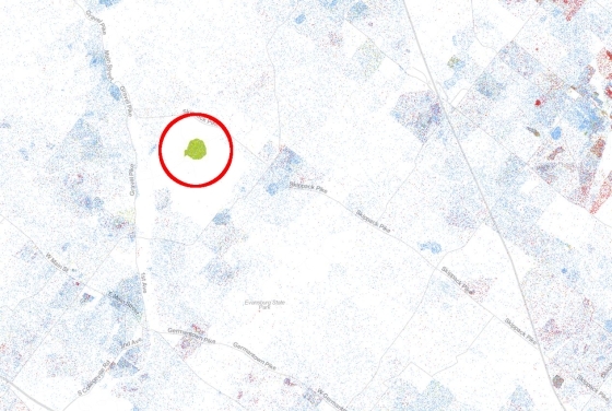
One of the most frequent observations from people who have recently viewed our new Racial Dot Map is the presence of these “little green boxes” scattered throughout the country.  The map displays a single dot for every person counted during the 2010 Census and every dot on the map is color-coded by race and ethnicity:  non-Hispanic whites = blue; African-Americans = green; Asians = red; Hispanics = orange; and all other races = brown.  These peculiar green boxes on the map can be found everywhere and seem oddly out of place:

In a suburb of Philadelphia:

Philly

Continue reading

The New Racial Dot Map

As our regular readers already know, I’ve been playing around with a lot of dot density maps lately.  Today, however, we are releasing something new I think you might enjoy even more.

We decided to rehash Brandon Martin-Anderson’s idea of plotting one dot for every person in the United States, but with an added twist.  The new Racial Dot Map is an American snapshot; it provides an accessible visualization of geographic distribution, population density, and racial diversity of the American people in every neighborhood in the entire country. The map displays 308,745,538 dots, one for each person residing in the United States at the location they were counted during the 2010 Census. Each dot is color-coded by the individual’s race and ethnicity.

RacialDotMap

The map is fully interactive so you can zoom into any neighborhood you wish.  You can read more about the map and how we created it here.

Enjoy!

Dustin Cable is a Senior Research Associate at the University of Virginia’s Weldon Cooper Center for Public Service where he conducts research on topics that lie at the intersection of demographics, politics, and public policy.

The Census Bureau’s new Language Mapper

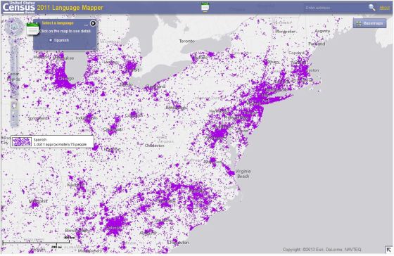
As far as afternoon diversions go, the latest language use visualization from the U.S. Census Bureau is one of the more entertaining. The Bureau is making good use of its American Community Survey data with the launch of the new Language Mapper widget. The interactive application displays a dot-density map for 15 separate languages and allows users to zoom down to specific regions and cities throughout the country.

ACS Language Use Map

Along with counting the number of foreign language speakers in a particular area, the map also breaks down language speakers by English proficiency. Not surprisingly, the country’s major metropolitan areas harbor the greatest number of foreign language speakers who do not speak English “very well.”

Well worth a couple minutes of your afternoon…

Dustin Cable is a Senior Research Associate at the University of Virginia’s Weldon Cooper Center for Public Service where he conducts research on topics that lie at the intersection of demographics, politics, and public policy.

Virginia, voting rights, and the removal of the preclearance requirement

The recent Supreme Court decision on the Voting Right Act will have wide repercussions, particularly for Virginia, a state which was previously held to the preclearance requirement that was just struck down on Tuesday.

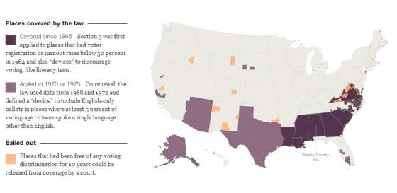
For those who are unfamiliar with the act, one of the key provisions for deterring and preventing racial discrimination at the polls was a procedure called “preclearance”. Certain states and counties that had a troubled history with discrimination and low turnout at the polls had to have any changes made to their election laws “precleared” by the federal Department of Justice before implementation. These states and counties were identified in 1965, when the Voting Rights Act was first passed, by using a formula based on turnout statistics and the use of voter suppression devices, such as poll taxes or literacy tests. Most of the states and counties identified in 1965 remained under the preclearance requirement until today, including most of Virginia.

Preclearance States and Countys under the Voting Rights Act of 1965

Source: New York Times

Continue reading

New Demographic Data on the 2012 Presidential Election

The recent release of the Census Bureau’s Voting and Registration data from the Current Population Survey finally allows us to look deeper into the population that turned out to vote this last November.  And the results are quite astonishing.

For the first time, in a long history of disenfranchisement and suppression, African-American voter turnout surpassed the turnout rate among whites.  2012 was a low-turnout election overall, especially when compared to 2008, and the turnout rates among most of the major racial and ethnic groups went down from 2008 rates.  The turnout rate among blacks in 2012, however, went up.

National Turnout Rates for 2012 Election by Race

* Turnout is measured here as total votes divided by the voting-age citizen population. Data are from the CPS microdata for the Voting and Registration Supplement.

Continue reading

Regional Cost of Living Adjustments for Poverty Rates in Virginia

Common sense tells us that the cost of goods and services are different in different parts of the country.  For instance, the economic reality and expenditures of families living in Northern Virginia are not the same as those living in Lynchburg or those living in Wise County.  The cost of housing and rent is particularly variable, but other basics such as food or transportation are surprisingly different across Virginia’s regions as well.

Despite common sense, official poverty rates do not account for this variability.  The income threshold for poverty for a family living in New York City is the same for a similar family living in Fargo, North Dakota.  More disturbingly, billions of dollars of government benefits and services are distributed to localities and families based on the official poverty measure.  Other public and private organizations also use the official statistics to target their operations.

With so much at stake, a new poverty measure that addresses regional differences in the cost of living is needed.  The Census Bureau has recently developed the Supplemental Poverty Measure (or SPM) to do this at the national level, but states and localities are at a disadvantage.  Only 3-year SPM averages are available for states and none are available at the sub-state level.

Virginia, however, now has a new alternative poverty measure that accounts for regional differences in the cost of living and provides sub-state estimates of poverty rates.  As elaborated in my previous post, the new “Virginia Poverty Measure” (VPM) provides some interesting insights about economic distress in the commonwealth, but perhaps the most striking results are the result of its regional adjustments.

Continue reading